What connects to Sympheny.
Sympheny is built to fit into the data, tools, and reporting workflows energy planning teams already use: from GIS and tariff data on the way in, to in-app reports, dashboards, and API access on the way out.





Connect the systems you already run on
Sympheny fits into the GIS, enterprise, and developer tools energy teams already use, so projects build on your systems of record and identity instead of a separate island of spreadsheets.
Esri ArcGIS
Use ArcGIS layers and basemaps for site context, building footprints, and district boundaries inside the project workspace.
Learn more
Geoimpact
Swiss building, demand, and renewable potential data integrated for fast project setup across cantons and municipalities.
Learn moreSAP
Connects Sympheny's energy model outputs to SAP enterprise energy and asset management workflows.
Single sign-on (SSO)
SAML / OIDC SSO for enterprise customers, integrating Sympheny access with your existing identity provider.
REST API
Programmatic access to projects, scenarios, optimisation runs, and results, for automation, batch studies, and internal tooling. Every endpoint is publicly documented, with authentication and schemas.
Learn morePython SDK
sympheny-toolbox, the official Python client. Every documented endpoint as a typed method, with matching sync and async APIs, and worked examples for building a scenario from Excel and running a solver job.
Learn moreMCP server
Coming in the next few weeks: connect Sympheny to AI assistants and coding agents over the Model Context Protocol. Client setup is documented ahead of launch; until it ships, the REST API and Python SDK do the same job. An assistant sets scenarios up and reads results; the optimisation itself still runs on the deterministic MILP engine.
Learn moreEnyTool
Scripting and advanced workflow tooling for teams that want to drive Sympheny from notebooks or build repeatable analysis pipelines.
Learn moreWebhooks & exports
Trigger downstream systems when optimisation runs complete, or schedule recurring exports of results into your data stack.
Specialised network design, with partners
For district-heating and network projects, partner engines plug into your Sympheny model to take a concept to engineering detail: thermal-network design from Planeto and GIS route optimisation from Gilytics.

Planeto
Heat-network planning that takes a Sympheny concept to engineering detail: thermal-energy modelling (including boreholes), heat-demand simulation, and routing of the heat network simulated under real heat loads. A University of Geneva spin-off focused on district heating and cooling.
Learn more
Gilytics
GIS-based network route optimisation. The Pathfinder engine finds least-cost paths for large networks, grids and district-heating routes, treating layers of spatial constraints as penalty functions and costing the resulting network.
Learn moreLocal context, built in
Sympheny ships with the geographic, building, weather, and tariff data teams need to start from a defensible baseline, instead of sourcing and rebuilding inputs by hand.
Standard load profiles
Built-in profiles for 50+ building types (residential, commercial, industrial) with seasonal and weekday/weekend variation.
Weather & solar irradiation
Regional weather and irradiation data sets feed hourly simulations and PV yield modelling without extra import work.
Tariffs & CO₂ factors
Dynamic tariffs, time-varying grid CO₂ intensity, and regional emission factors update assumptions automatically.
CAPEX / OPEX benchmarks
Maintained cost benchmarks for standard technologies provide a starting point that teams can override per project.
Built on engineering-grade solvers and research
Behind the interface, Sympheny runs on industrial optimisation engines, secure cloud infrastructure, and energy-systems research developed at Empa since 2014.
Gurobi Optimizer
Industrial-grade mathematical optimisation engine powering multi-objective scenario search across thousands of technology and capacity combinations.
Learn moreSense energy hub solver
Sympheny's V3 solver engine delivers faster execution, more flexible hub topologies, and richer constraint handling than the previous generation.
Empa & Berkeley Lab research
Built on energy systems and optimisation research developed at Empa since 2014, with ongoing collaborations with Berkeley Lab.
Learn more AWS cloud infrastructure
Hosted on AWS in Europe with autoscaling compute for optimisation jobs and isolated project workspaces per customer.
Learn moreHand off results in the formats stakeholders use
The same model that runs the optimisation produces the visuals, comparisons, and reports your stakeholders see. No rebuilding charts in slide decks before a steering committee.
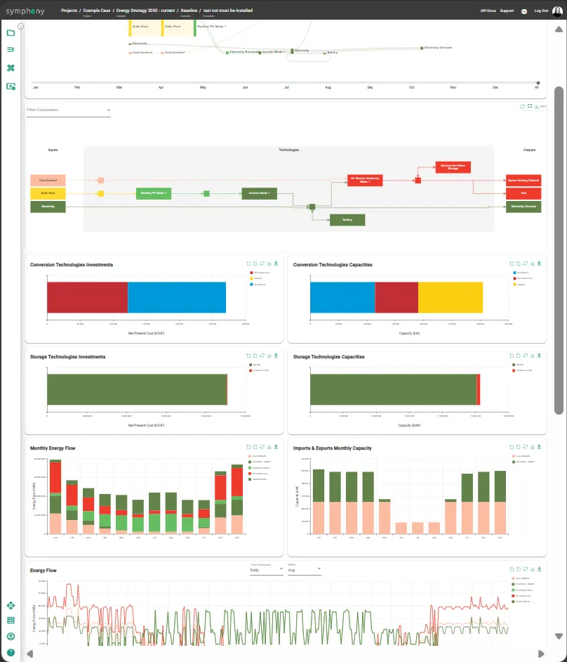
In-app reports
Run outputs (assumptions, scenario comparison, KPIs and energy-flow diagrams) viewable directly in the project workspace and printable from the browser.
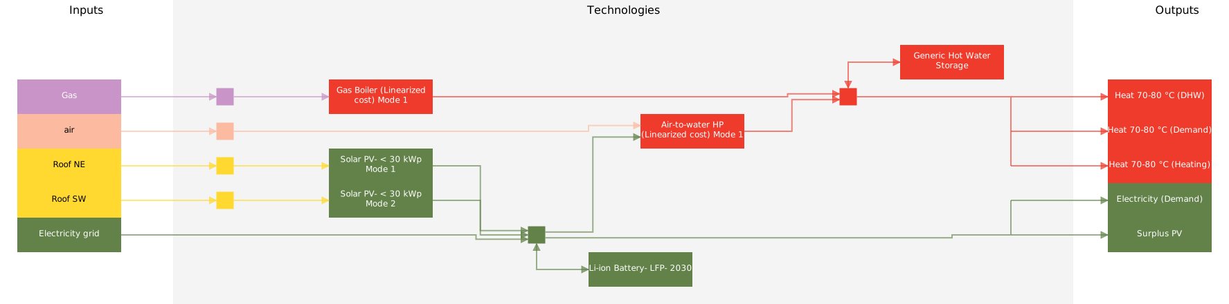
Sankey energy flows
Sankey diagrams showing energy flows from sources through conversion to final demand, viewable in-app.
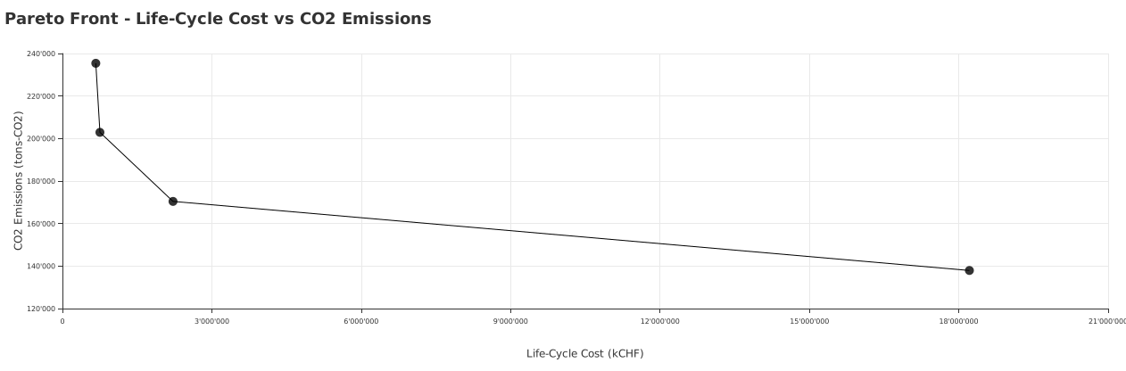
Pareto scenario comparison
Every optimised scenario plotted on cost vs. CO₂ in one chart, so the trade-off curve is visible at a glance.
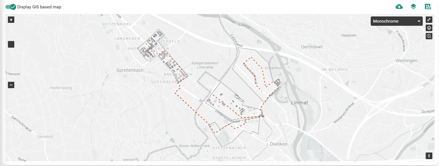
GIS hub views
Map-based views of energy hubs in their geographic context for stakeholder review and public communication.
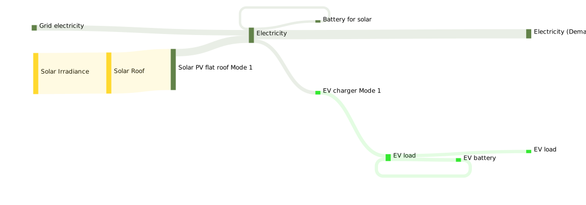
Image & SVG exports
Charts, GIS views and Sankey diagrams export as image or vector files for direct use in presentations and slides.
See Sympheny in your stack.
Book a 30-minute live demo and we'll walk through how Sympheny fits with the data and tools your team already uses.