Build defensible energy scenarios from your project inputs, in one workflow
See how engineering, utility, and public-sector teams use Sympheny. They pull their inputs in, run the optimiser across thousands of options, and give decision-makers a recommendation that holds up.
Scenario setup, optimisation, and reporting in one workflow.
A four-step workflow, from project inputs to client-ready outputs.
The same platform takes you from raw project inputs to optimised scenarios to a report you can hand to a client, without rebuilding the model in between.
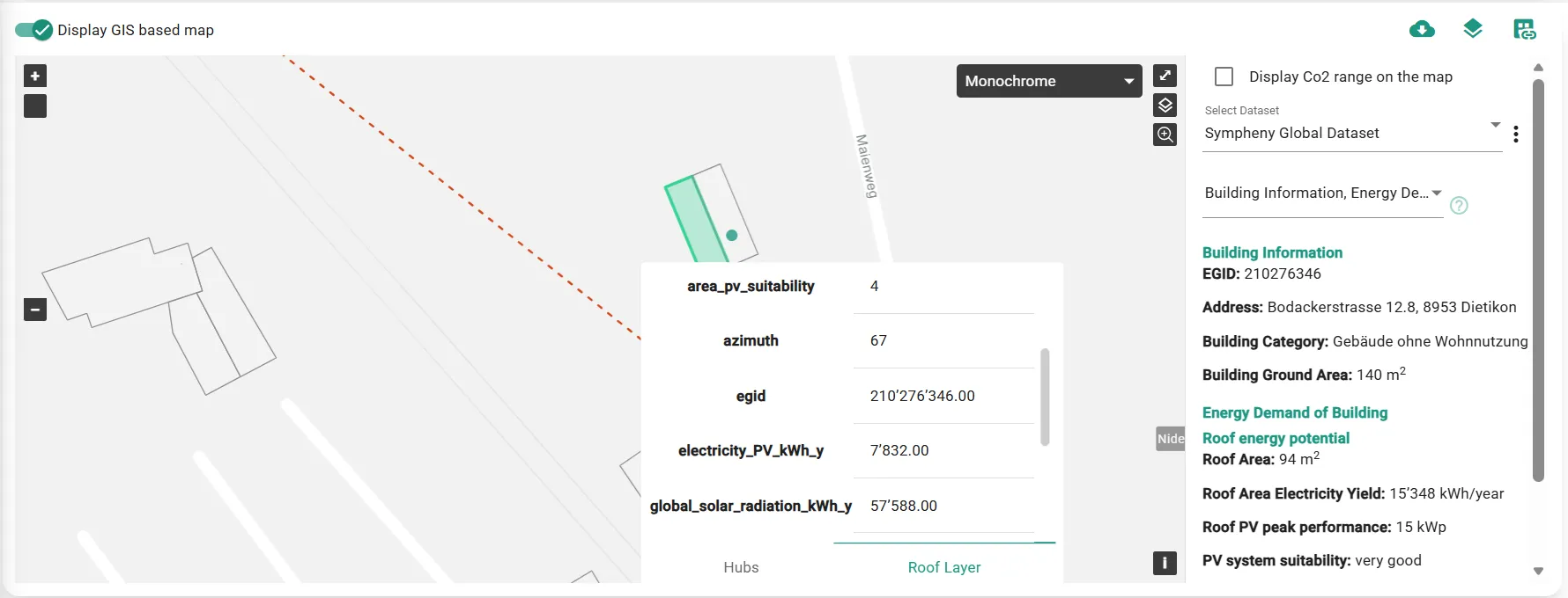
Bring project inputs together
Pull demand profiles, site characteristics, tariffs, and benchmarks into the project. Sympheny sets the locally relevant assumptions for your region, so teams start from a solid baseline instead of stitching together spreadsheets.
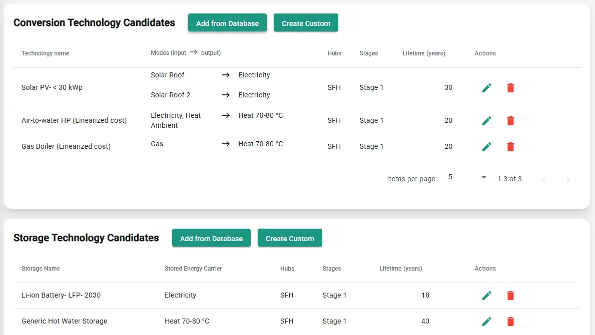
Build and optimise scenarios
Define the technologies and constraints that matter, then let the multi-objective optimiser search across 50,000+ technology and capacity combinations (district heating networks, heat pumps, solar storage and more) to find the architectures that meet your cost, emissions, and space targets.
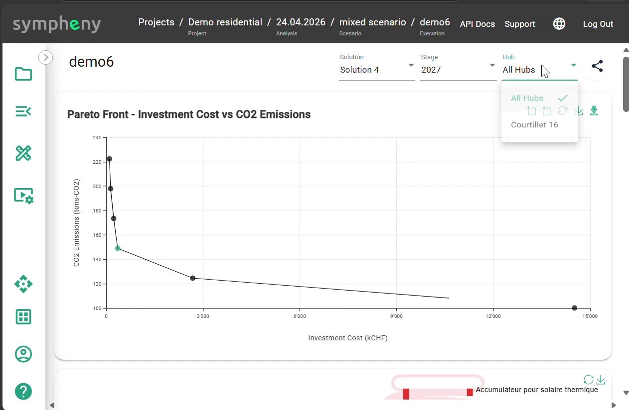
Compare trade-offs
Put every optimised scenario on a Pareto Front across cost and CO₂. See the cheapest option, the lowest-carbon option, and the trade-offs in between, so the recommendation holds up to scrutiny.

Share client-ready outputs
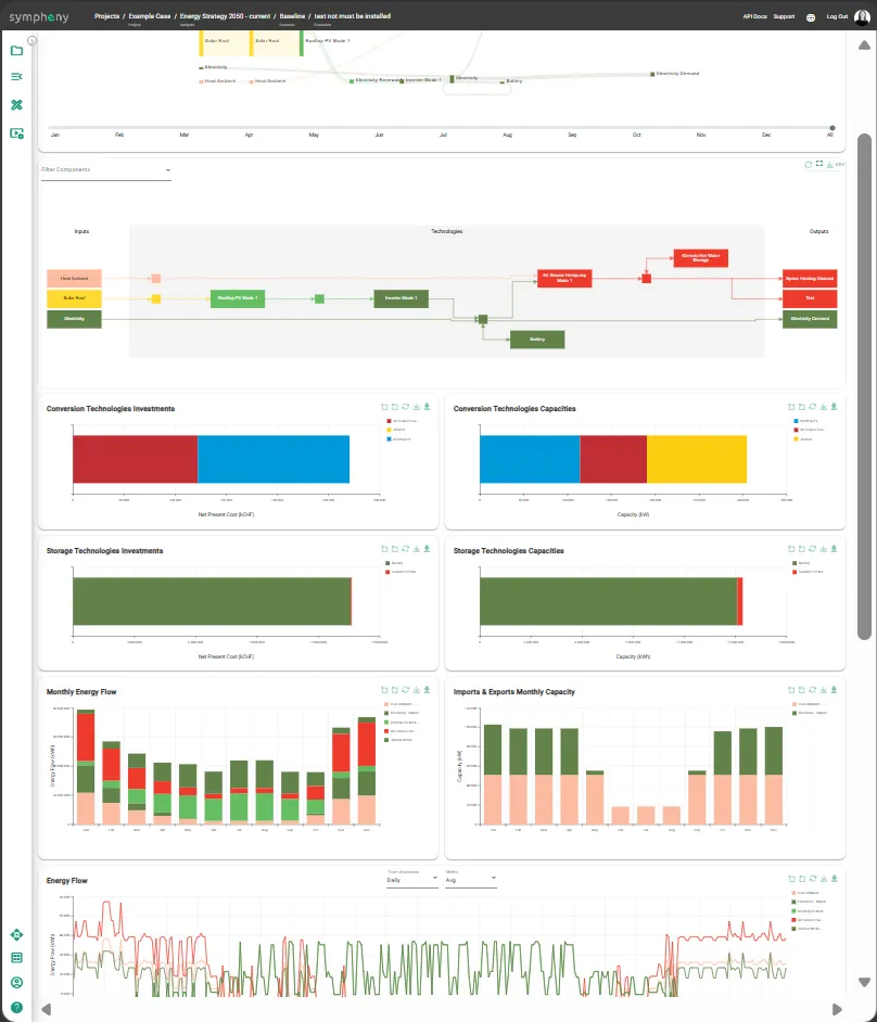
Sankey diagrams, Pareto comparisons, technology investments, capacities, and monthly energy flow all sit in the same interactive dashboard. Filter the view, download the graphs and their data, and print straight from the browser. The project lives on as a digital twin of your site, so you can re-run it as inputs change without rebuilding the model.
Optimise the system, not isolated components.
A heat network, PV system, storage asset, or grid connection may look optimal alone while weakening the wider energy concept. Sympheny compares integrated scenarios so teams can see system-level trade-offs before decisions are locked in.
“With Sympheny I compared far more energy-system variants in my project work than would ever have been possible by hand in Excel. And for each variant I could see straight away what it meant technically, in energy terms, and economically.”
Client-ready results, built from your inputs.
How different teams use the workflow
The same workflow adapts to what each team works on, from the projects they run to the calls they have to make.
Engineering firms
Turn fragmented inputs into scenarios that hold up under client scrutiny, and free senior engineers from manual data prep to focus on the engineering judgement clients pay for.
Explore the workflowUtilities
Plan across networks, tariffs, and long-term investment horizons, then take the same scenarios into infrastructure decisions and conversations with the regulator.
Explore the workflowMunicipalities
Build city-wide energy strategies and district plans on a timeline that works for public-sector processes, with reporting the council and the public can trust.
Explore the workflowDevelopers & Industrial Sites
Compare site energy concepts on CAPEX, OPEX, CO₂, grid constraints, and phasing before you commit to major infrastructure.
Explore the workflowThe workflow at the scale planners face.
Green hydrogen produced on-site at a cost comparable to diesel, with life-cycle costs cut 26% versus the fossil baseline.
Read case studyThree city-wide scenarios confirmed a CO₂-free energy supply is achievable at similar life cycle costs to today's fossil-based system.
Read case study26 buildings across 12 hubs in one living plan: 10% reduction already achieved, with 25% more modelled toward the 2030 climate-neutrality target.
Read case studyThe platform, in motion.
A 2-minute orientation and a look at the results your team actually delivers.
Sympheny in 2 minutes
What the platform does, how the workflow runs, and who it's built for.
What your results look like
The outputs from an optimised run: Sankey energy flows, investment and capacity charts, and monthly demand profiles, all in the platform.
Want to see the workflow on a project like yours?
Book a 30-minute live demo and we'll walk through project setup, scenario comparison, and report export on a project that mirrors yours.